what's resmart?
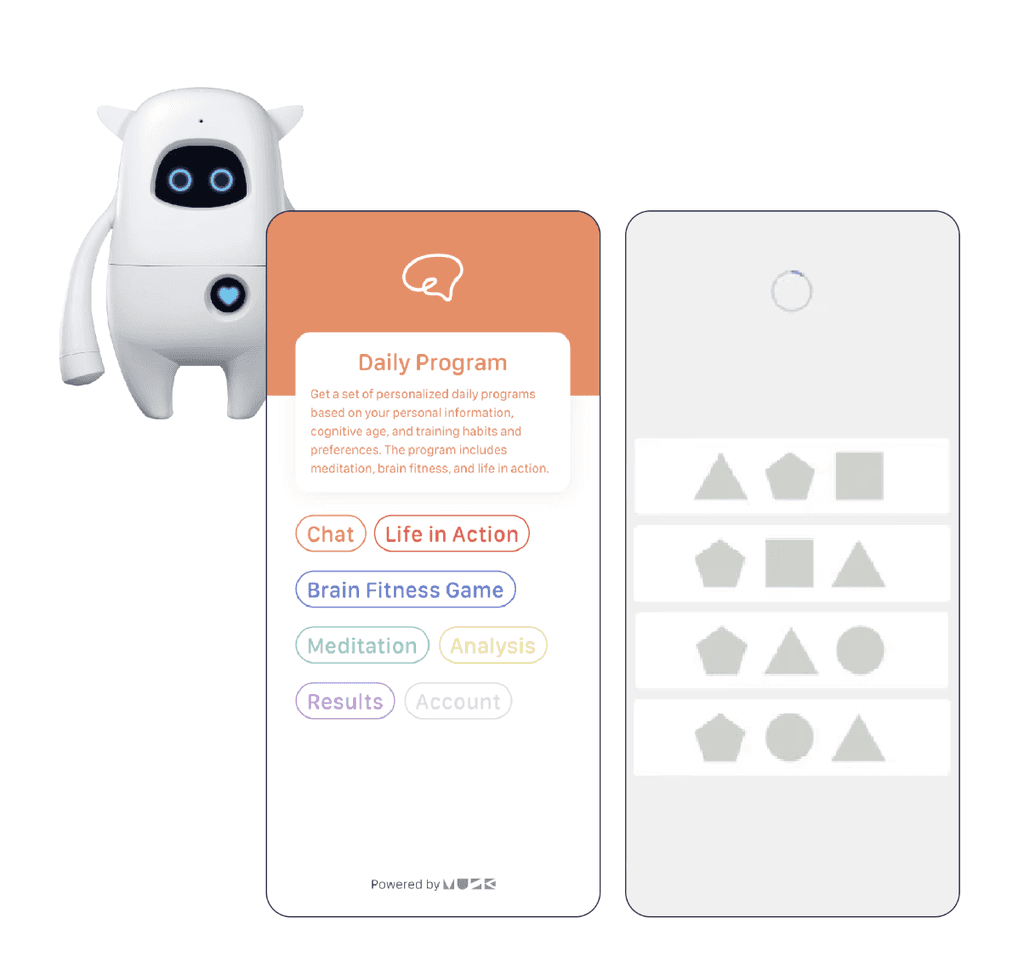
The mobile and robot platforms provide brain games, meditative sounds, and daily activity suggestions to support older individuals, who are more susceptible to dementia.
the challenge
Because ReSmart hadn't been updated in years due to other business priorities, the company wanted to "revive" it. I was to add a safety monitoring feature for those who lived independently or were in isolation.
the solution
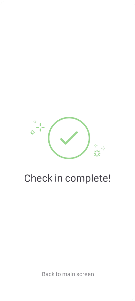
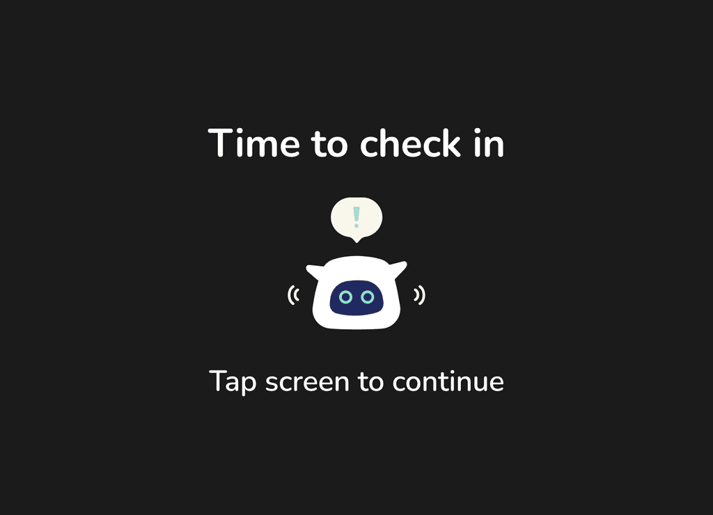
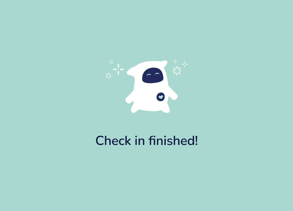
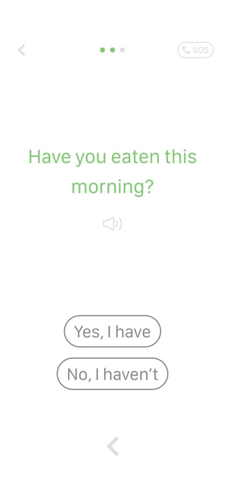
Users are asked brief, randomized questions on their physical, mental, and social states via questionnaire or voice chat for minimal user fatigue.
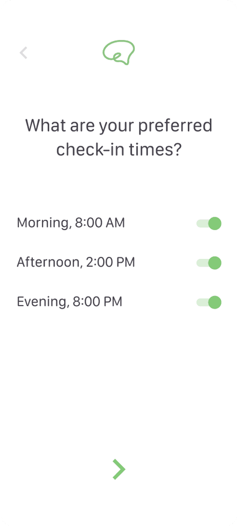
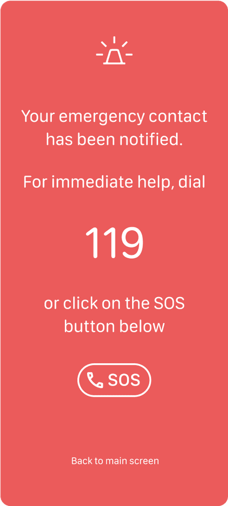
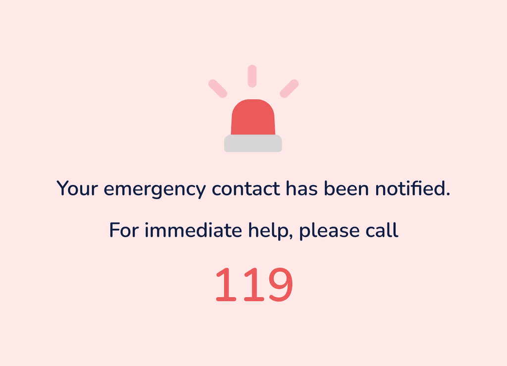
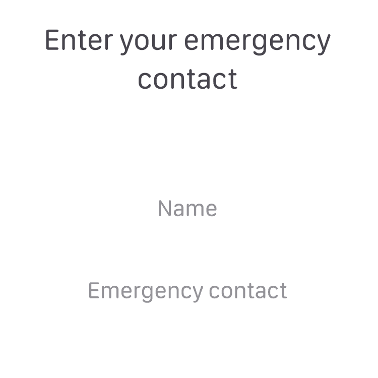
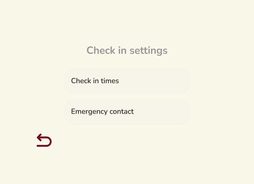
Preferred check-in times can be set to accommodate daily routines, and assigning an emergency contact is required for immediate support based on user input.
impact
Older adults are more likely to adopt app features that prioritize simplicity and user-friendliness, as shown by a qualitative study that explored the usability of a mobility app for individuals over the age of 60.
A research study found that error rates decreased by 45% and user satisfaction increased by 30% among older adults who used an interface with easy navigation.
understanding older users
Validating our target users' needs was necessary to map out the feature. Despite the push to design right away given time constraints and projects with higher urgency, we agreed to conduct secondary research and pinpoint design principles to prioritize specifically for the older age group.
translating the findings into design
The goal was to create a monitoring flow that was as quick and simple as possible. Given that the feature's main objective was to intermittently check a user's state as they perform their daily routine, tasks flows only consisted of a few number of steps.
In terms of content, we came up with brief questions that captured the the essence of what we wanted to track without being too lengthy, despite detailed questions being ideal from a researcher's point of view.
Setting preferences took a minimal series of actions, down to the most basic of information needed.
Accessibility is another design tenet commonly associated with simplicity. To reduce navigation and task errors, text and button sizes were large enough for users to see clearly, and only a few elements were included in a page.
In retrospect, while accessibility was prioritized, there were design decisions that I wish came to mind during the duration of the project, such as utilizing larger margins in buttons for more thumb-friendly interactions and colors for clearer distinctions among input actions – learnings for next time!
the major side quest
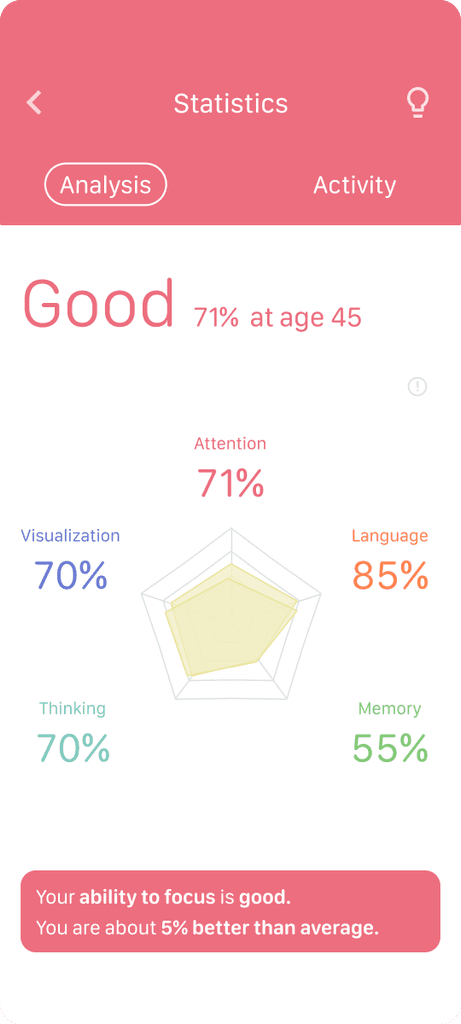
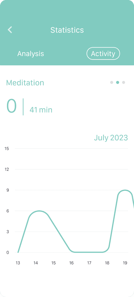
Since an app update was already in place, I proposed to conduct a quick UX audit to enhance the overall app experience. By prioritizing content hierarchy, Analysis and Activity graphs were subsumed into a new Statistics item for clearer navigation between the two categories.
before

after
Updates on specific pages were also made for stronger visual cohesion.
before

after

takeaways
Working on the check-in feature was a reminder of how at its very core, good UX is being as simple and intuitive as possible, especially when it comes to older user groups who are not as well-versed in technology.
Differences in opinions – in this case, on task priorities – can arise when working in a team. What's important is communicating with your teammates and making sure everyone's thoughts are considered to land on a decision that works for everyone.
This was my first time designing for a social robot app, which was a refreshing experience that made me further appreciate the field of human-robot interaction.


