Ansimi

Enhancing a crime map app's ease of use for purposeful tracking

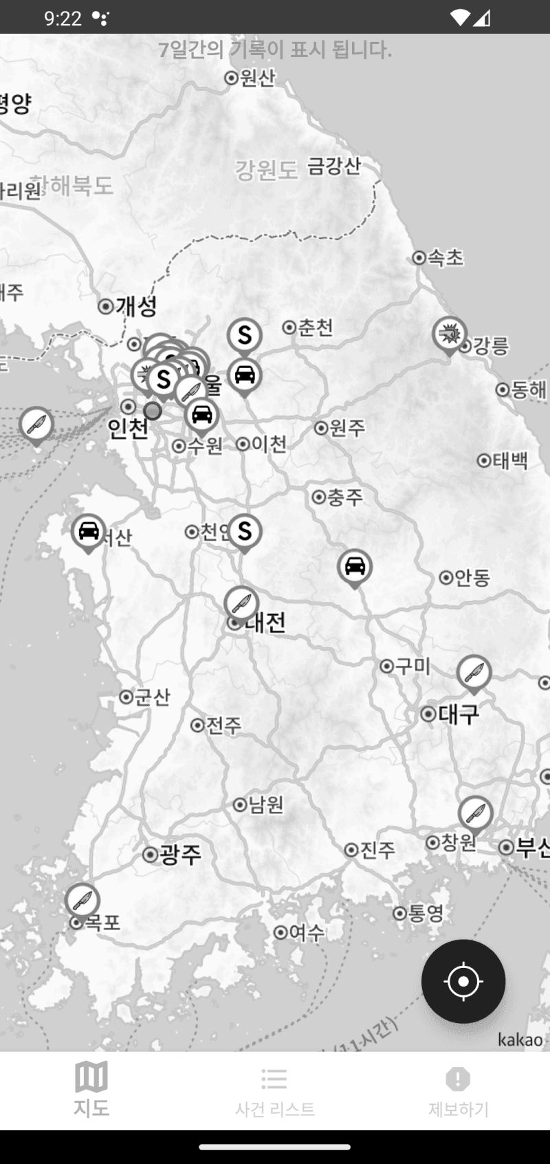
Ansimi is an app that provides users with real-time information on crimes occurring all around South Korea. I conducted a heuristic evaluation and redesign of the app’s overall user experience, which led to positive initial feedback and is expected to increase app downloads and user retention.

timeline

Oct - Jan 2023

Aug 2024

team

1 designer

1 developer

what i did

User research

Design audit

UX/UI design

tools

Figma

what's ansimi?

Ansimi is a crime tracking app for people to feel safe everywhere.

Ansimi is a crime tracking app for people to feel safe everywhere.

Given the multiple crime incidents and online murder threats that occurred in Korea in 2023, Ansimi was created with features geared towards safety.

View a neighborhood’s recent crime activity

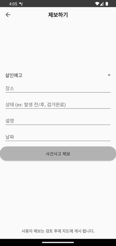
Report crime incidents witnessed within the vicinity

the challenge

How might we enhance Ansimi's design to provide users with a meaningful experience?

How might we enhance Ansimi's design to provide users with a meaningful experience?

Because the app was initially created without a designer, I was given the freedom to evaluate and make changes to the app’s current design to attract users and establish retention.

the solution

An optimized app structure, data navigation, and modern interface design.

An optimized app structure, data navigation, and modern interface design.

before

after

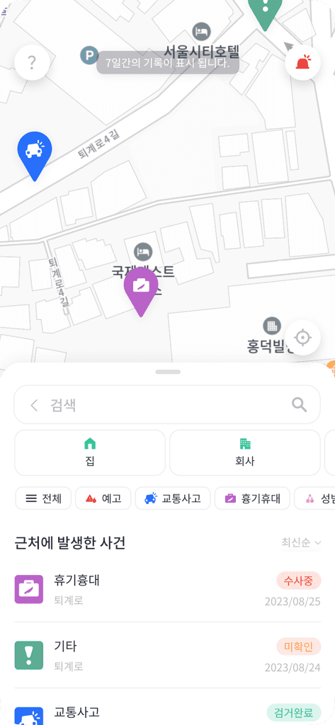
A thumb-friendly main page

A thumb-friendly main page

The screen has been reorganized with a collapsible component to let users take all possible actions with a minimal number of taps.

An efficient way to view data

An efficient way to view data

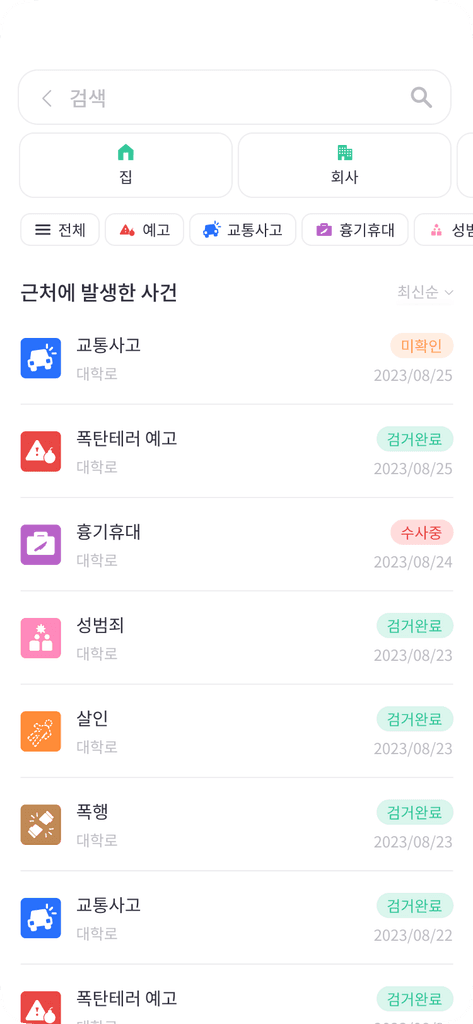
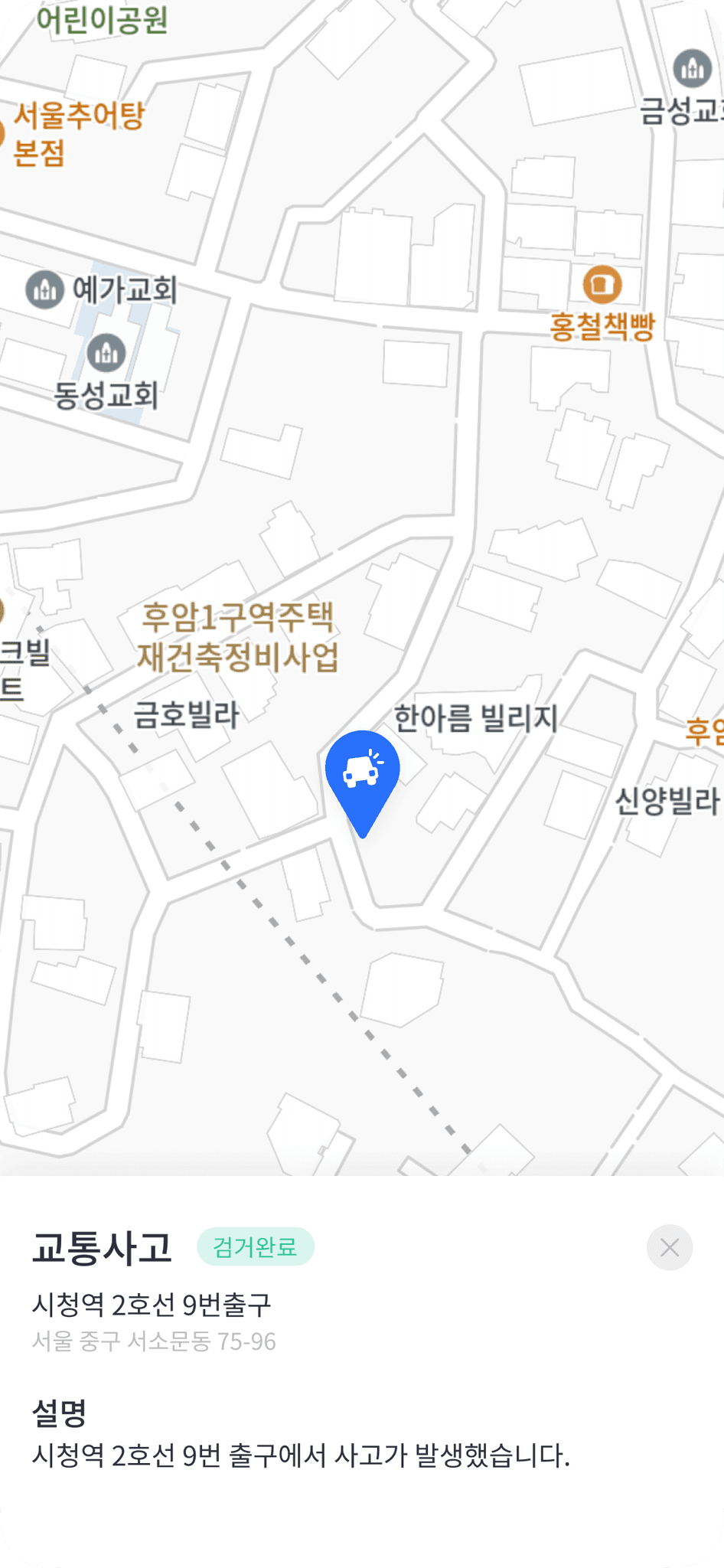
Readability of crime activities is improved through a two-step action. Users can draw more conclusions with sort filters.

before

after

before

after

Efficient and secure tracking

Efficient and secure tracking

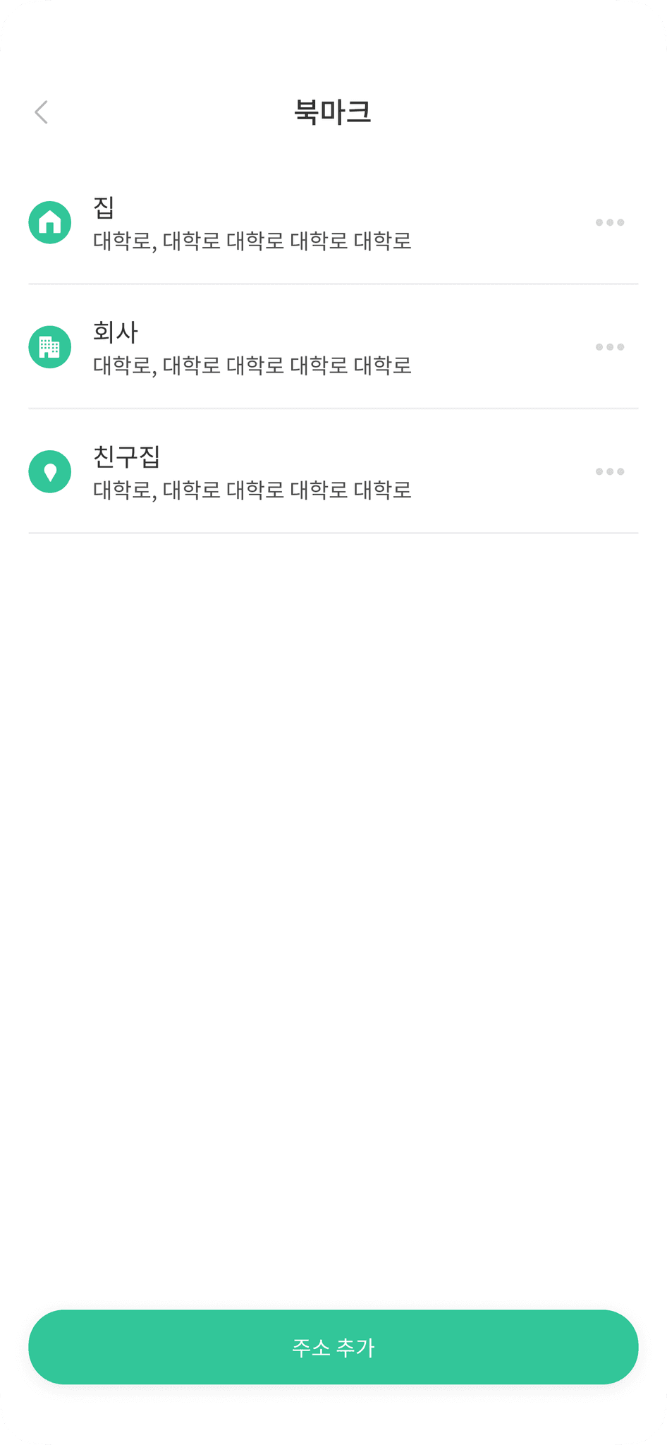
With bookmarks, and search and view history, redundant actions are reduced significantly.

Secure reporting

Secure reporting

Users are provided their report history and safeguards against possible report errors with the confirm and delete actions.

before

after

impact

Initial positive feedback

Initial positive feedback

Participants from a quick usability test found the app easy to use.

Expected increase in downloads and user adoption

Expected increase in downloads and user adoption

After Sephora adopted a bottom navigation that maximized the thumb zone, conversions increased. Google and Ipsos' research also revealed that 58% of users prefer companies with apps that kept track of their past actions.

why the redesign?

Information wasn't being used to its full potential.

Information wasn't being used to its full potential.

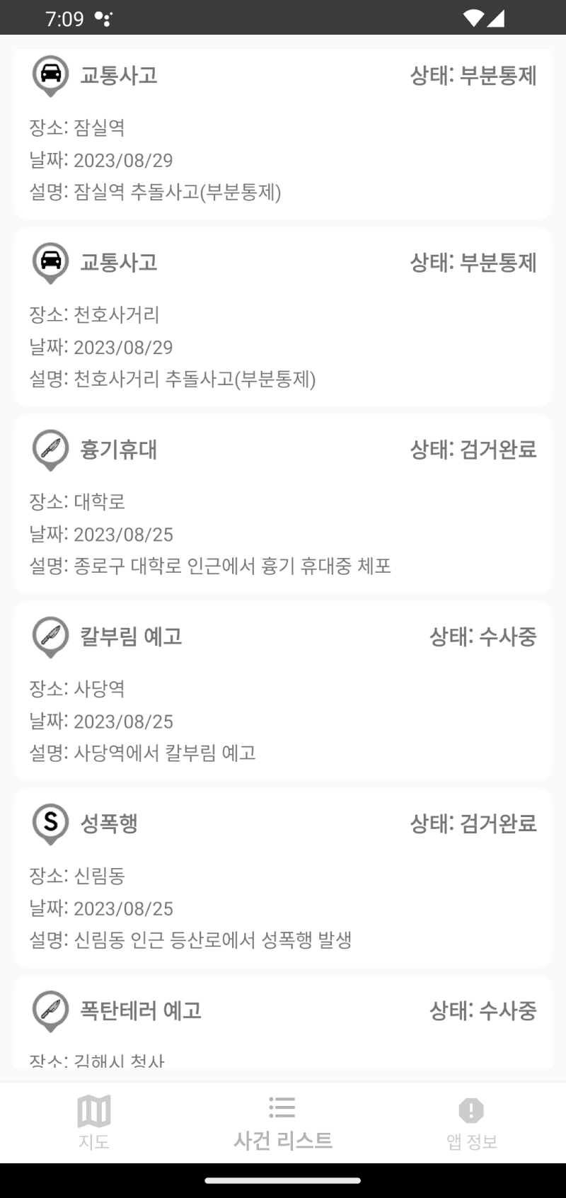
I assessed the app's usability using Jakob’s Ten Usability Heuristics across its core functions, and findings suggested that the app needed a major overhaul.

No shortcuts, search filters, or sort views

No shortcuts, search filters, or sort views

No shortcuts, search filters, or sort views

Limited to no access to previous actions

Limited to no access to previous actions

Limited to no access to previous actions

Presentation of information is not intuitive

Presentation of information is not intuitive

Presentation of information is not intuitive

No confirmation or way to undo actions

No confirmation or way to undo actions

No confirmation or way to undo actions

going back to basics

A more intentional navigation experience

A more intentional navigation experience

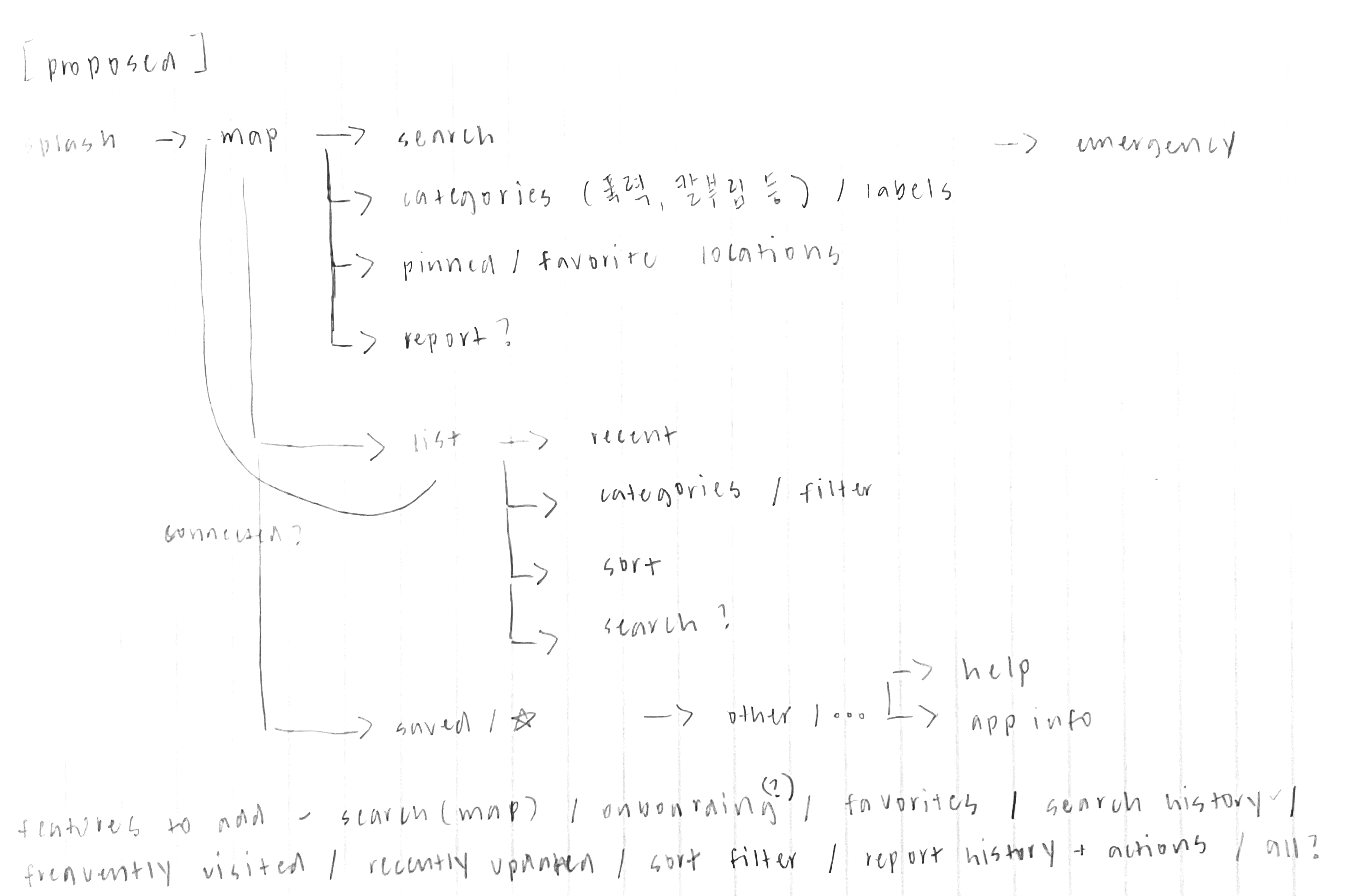
I made sure to address the lack of opportunity for purposeful action in the app's new information architecture by including app actions (i.e. sort, bookmarks) that made for a more contextualized experience.

Utilizing thumb-friendly design

Utilizing thumb-friendly design

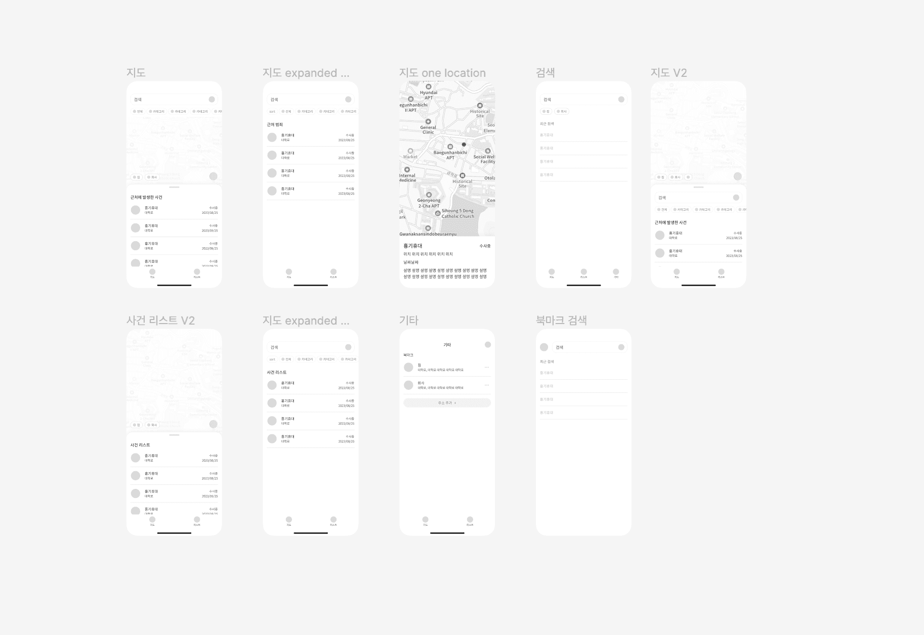
Throughout Ansimi's redesign, I was in constant communication with my teammate to confirm the feasibility of my redesign suggestions. This meant multiple iterations on the wireframes that led to a usable interface that – save for typing – can be navigated with just one hand.

Encouraging app activity

Encouraging app activity

As the initial app design lacked actions that allowed users to look through crime data efficiently, I suggested that we add more user actions that allowed for quicker and more meaningful interactions with available information, including search and sort filters, bookmarks, and action history.

Giving the app a branding makeover

Giving the app a branding makeover

Because this was a crime map app, we wanted the UI to elicit feelings of safety and reassurance. We settled on a concept with a teal-leaning green and a friendly icon to set the tone accordingly.

validating with users

Checking for things we missed

Checking for things we missed

We crossed most of our design goals off our list, but after gathering feedback from a few users, we realized a few points that we overlooked. We've been working on making more improvements to the app, like adding other ways to bookmark locations to account for other familiarity with other apps.

takeaways

Taking design risks

Taking design risks

Korean map apps normally place the search bar on top of the screen, switching Ansimi's layout to the thumb-friendly format was a gamble that prioritized accessibility over familiarity. However, it still led to positive initial feedback, which proves that taking design risks – provided that you can justify them – can lead to success.

Viewing limitations as opportunities

Viewing limitations as opportunities

While it can sometimes be challenging to find out that some ideas may not be possible because of technical limitations or timelines, I have become better at reframing the situation and viewing it as a challenge to think outside the box instead.
anyway, don’t be a stranger ⊹

If you want to chat about my work, possible collaborations, or anything under the sun, come say hi!

designed from scratch by margaux lim with ₊⊹

anyway, don’t be a stranger ⊹

If you want to chat about my work, possible collaborations, or anything under the sun, come say hi!

designed from scratch by margaux lim with ₊⊹

anyway, don’t be a stranger ⊹

If you want to chat about my work, possible collaborations, or anything under the sun, come say hi!

designed from scratch by margaux lim with ₊⊹