Prioritizing intuitiveness to drive sales chatbot engagement
Muse EOS (ExtraOrdinary Salesbot) is an AI chatbot that provides information to potential car buyers about the vehicle that best suits their needs. I iterated on rough product ideas, translating them into an interface that gathered positive initial feedback and an expected increase in user conversions.
timeline
Jul - Oct 2023
what i did
UX/UI design
Product thinking
Illustration
team
1 designer
3 developers
1 project lead
tools
Figma
Adobe Illustrator
why muse eos?
Given that car buyers typically spend a lot of time finding the perfect car, we were prompted by our company's decision makers to design an AI-driven chatbot that made the process more efficient.
the challenge
My task was to design a functional chatbot interface that helped ensure users were well-informed when booking a test drive or placing a car order, consequently establishing the product's value in the car-buying process.
the solution
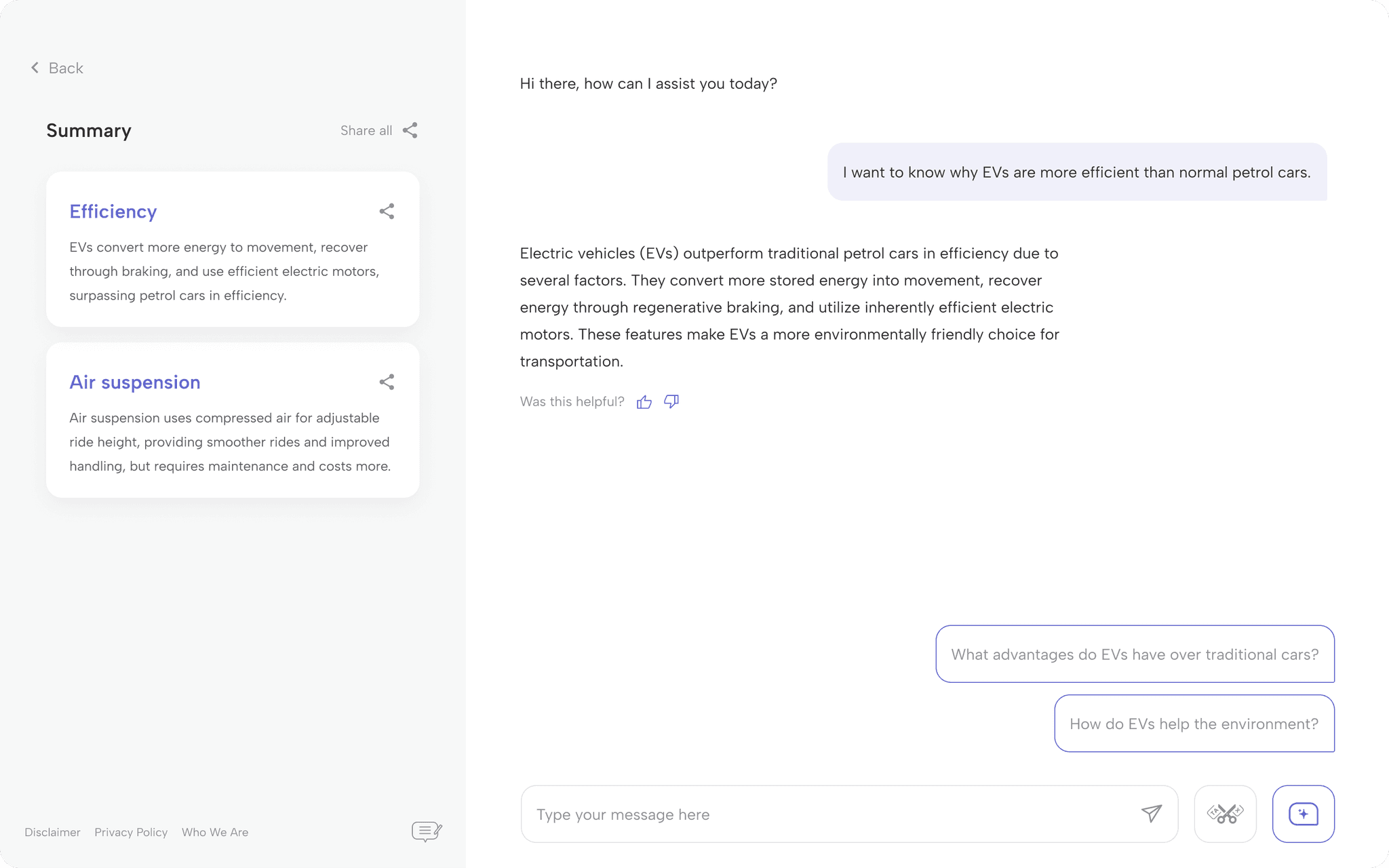
Features are divided clearly for navigation and readability, with distinct chat bubble designs to account for long text and differentiate purpose.
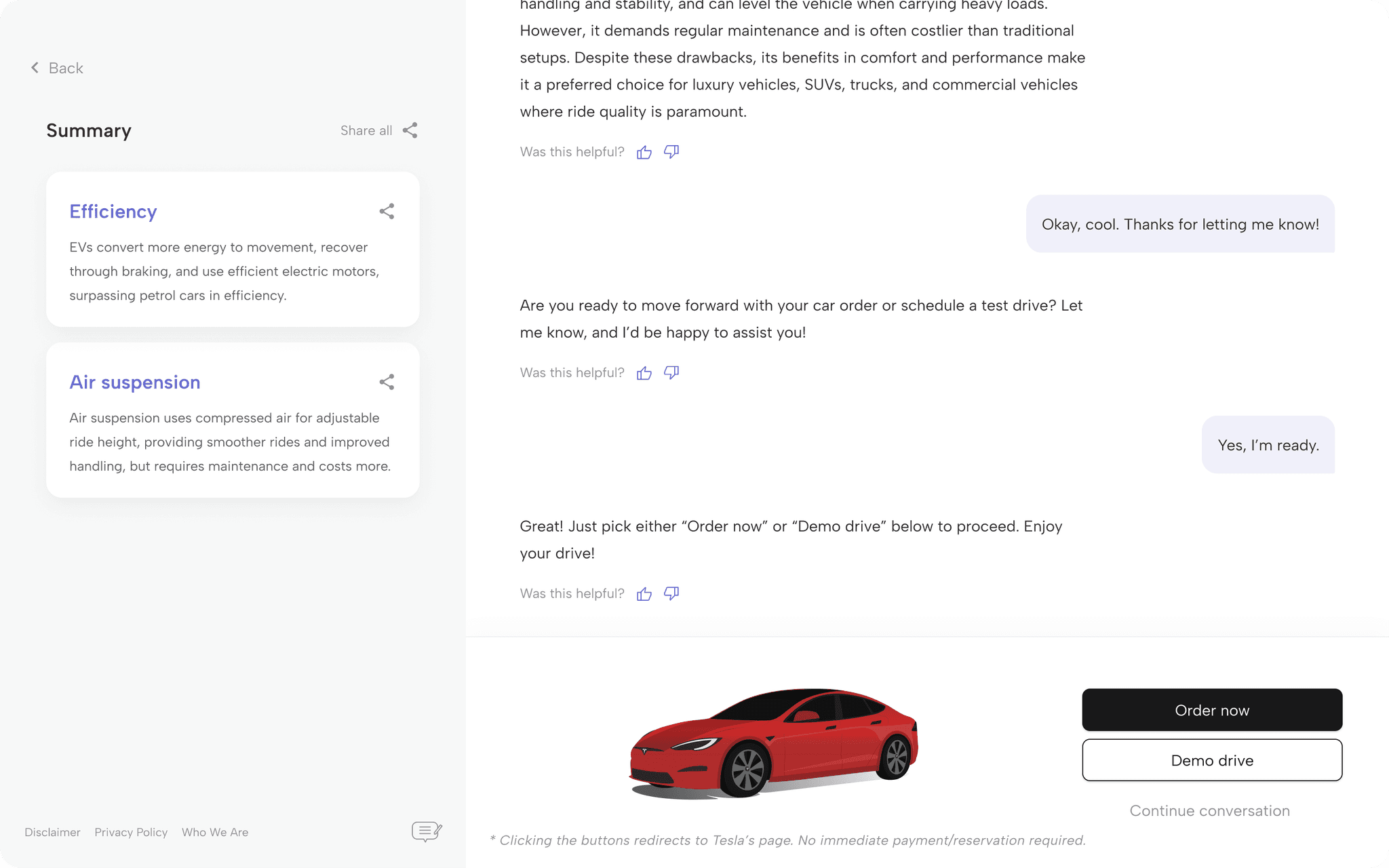
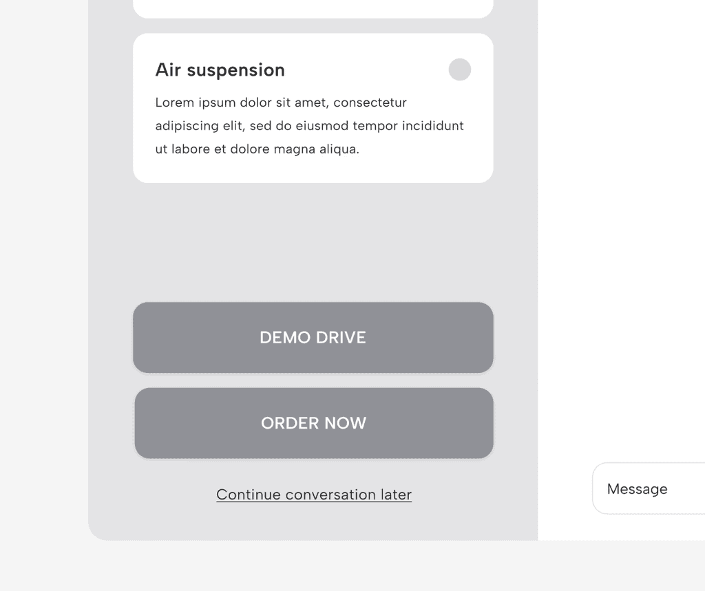
Definite actions to advance the car-buying journey are proposed to users based on the conversation flow for an informed and focused decision-making.
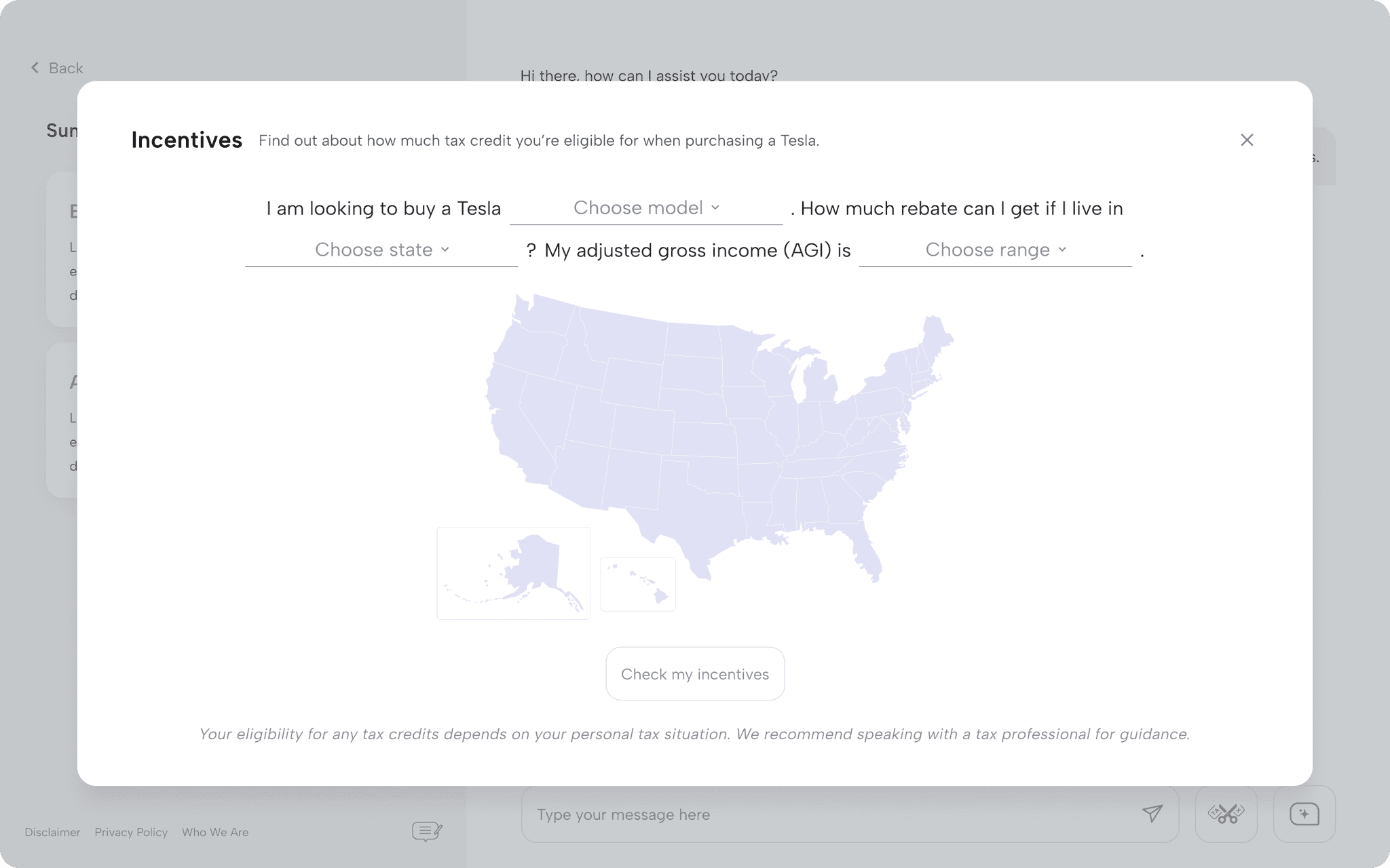
Although learning about specific information on car tax incentives is separate from the main chat, the feature is designed to integrate seamlessly with the chatbot.
impact
Early users mentioned the chatbot's clean design and intuitiveness.
Balanced visual elements contribute to website credibility, which suggests longer session durations. A study by HubSpot also found that personalized CTAs perform 202% better than basic ones.
establishing ground rules
Although company's priorities meant limited to no user research during product conceptualization, I took the initiative to create a design based on best chatbot practices and relevant design principles, accompanied by team design reviews.
design iteration highlights
Making the "Order now" and "Demo drive" buttons always visible on the screen made for easy access, but we added the buttons to a sheet that appeared only depending on the conversation to prevent overwhelming the user and allow them the time to decide at the appropriate context.
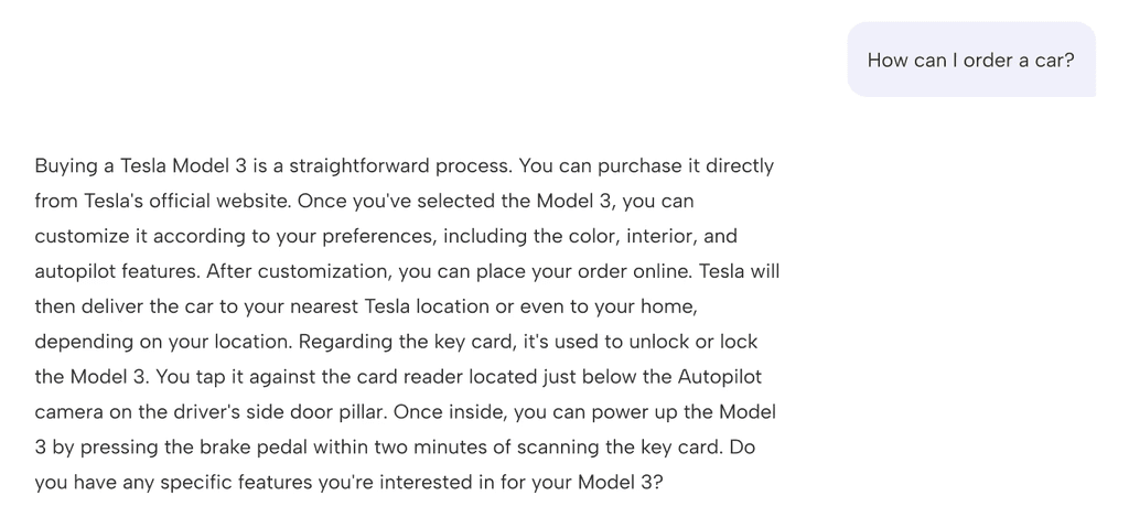
Readability is always important in design, especially in cases where large chunks of text are present. However, we strayed from the standard chat bubble design and removed the background for the AI chat bubble for users to read paragraphs easily with fewer distractions, similar to reading an article.
Fun fact: We came up with this decision before ChatGPT was updated with a similar chat bubble style, which was a cool coincidence!
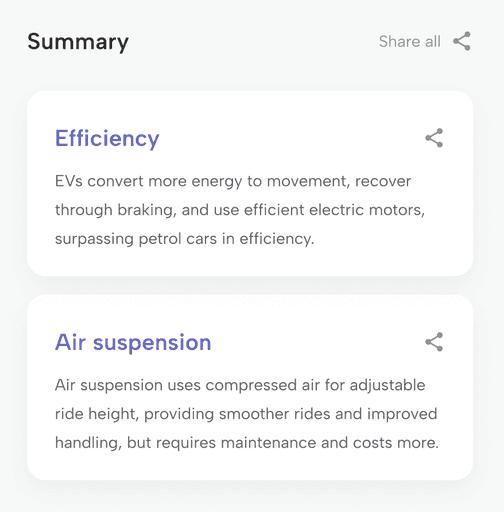
As for the summary cards, no topic summary was to go over three lines (– it wouldn't be much of a summary if that were the case –) to for users to process the information more quickly.
Action buttons were placed on the text input toolbar to encourage users to maximize the chatbot's suggested prompt and incentive features. This made for more feature visibility and exploration – additionally, the flexible layout sped up design updates when we had to add the tax rebate feature.
creating responsive design
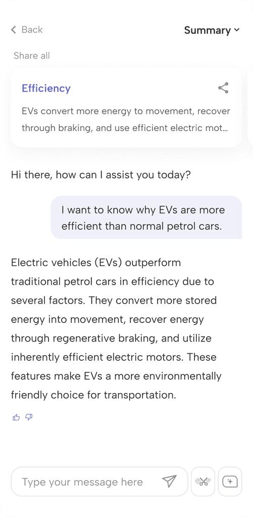
I adapted the design to multiple screen sizes by considering possible user interactions per device, such as horizontal scrolling for the summary cards on touchscreens as opposed to vertical scrolling on the desktop.
the not-so-side quest
Our AI chatbot was initially trained on Tesla vehicle information, but we couldn't use official images due to copyright restrictions. Being the sole designer in the team, I created vector illustrations of the available models through Adobe Illustrator.
takeaways
Product design means constant change. Creating a scalable design that accounts for future developments such as new features – take the tax incentive feature, for instance, which was a later addition to the chatbot – requires thinking ahead and always being ready to adapt.
While designing with the smallest screen first is standard UI practice, I was asked to begin with the desktop version for this project. This taught me to be more critical about rearranging elements without compromising quality.
In situations where formal user testing is limited, gathering feedback from those around you, from team members to colleagues, can be a huge help. The chatbot's final design wouldn't have been possible without hearing my teammates' views on my ideas.
wait, there's more
Contact me to find out more about other things I've worked on for the project (hint: dashboards)!
